Everyone and their dog, as well as their dog’s fleas, must by now know of the many suits Apple has brought around the world against Samsung, in which there are accusations of patent infringement and similar.
One such case took place recently here in the UK, and it didn’t go Apple’s way. Without going into any great detail, a very brief summary of events is as follows:
On 9th July, 2012, the High Court of Justice ruled against Apple, finding that Galaxy Tab range didn’t infringe on Apple’s registered design, and this was upheld in the Court of Appeal on 18th October, 2012. After the case in July, Apple was ordered to publish a statement on its UK homepage, and in advertisements in certain printed publications, detailing the outcome of the case. This order was upheld and expanded on after the appeal case in October, adding a second paragraph noting that the judgement had effect throughout the EU.
Rather than just do as ordered, Apple published something a touch longer on their website, which basically said that the UK courts had found against them, but other courts had disagreed, specifically referencing the US case (in which the Tab wasn’t found to infringe anyway) and the German case (which shouldn’t have even been started because Apple had already brought the case against Samsung in the UK).
In other words Apple were sticking their finger up at the UK verdict.
Unsurprisingly, they were slapped down about this and ordered to remove that statement and replace it with the actual statement specified in the order, and include a statement on their UK homepage linking to it (referring to their previous statement being incorrect).
They’ve now done this. If you visit the Apple’s UK homepage, at the bottom of the screen you will see this text:
On 25 October 2012, Apple Inc. published a statement on its UK website in relation to Samsung’s Galaxy tablet computers.That statement was inaccurate and did not comply with the order of the Court of Appeal of England and Wales.The correct statement is at Samsung/Apple UK judgement.
For completeness, the link leads to a page with this text:
Samsung / Apple UK judgment
On 9 July 2012 the High Court of Justice of England and Wales ruled that Samsung Electronic(UK) Limited’s Galaxy Tablet Computers, namely the Galaxy Tab 10.1, Tab 8.9 and Tab 7.7 do not infringe Apple’s Community registered design No. 0000181607-0001. A copy of the full judgment of the High Court is available from www.bailii.org/ew/cases/EWHC/Patents/2012/1882.html.
That Judgment has effect throughout the European Union and was upheld by the Court of Appeal of England and Wales on 18 October 2012. A copy of the Court of Appeal’s judgment is available from www.bailii.org/ew/cases/EWCA/Civ/2012/1339.html. There is no injunction in respect of the Community registered design in force anywhere in Europe.
So, on the face of it, they are now complying with the order. Hurrah!
However, let’s take a closer look at their website, with a few screenshots. Each image is of my full 1920 x 1080 screen, with two browser windows open side by side, each taking up one full half of the screen width. Within each image, the browser windows are the same height, and the one on the left shows Apple’s UK homepage, and the one on the right their main homepage.
In the first image, the windows are open to approximately half of my screen’s height:

The difference between the two homepages is immediately obvious – the picture of the iPad mini is larger on the non-UK homepage.
So what?
Well, let’s make the browser windows taller and look at them again:
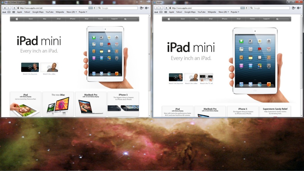
In the second image, I’ve increased the height enough so that the four links are shown fully along the bottom of the UK homepage. As you can see, the iPad mini picture remains the same size as before on both homepages, larger on the main homepage, on which the four equivalent links are partly below the visible area – so still “not that big of a deal” then – but what if the browser height is increased so that the four links on the main homepage are fully visible?
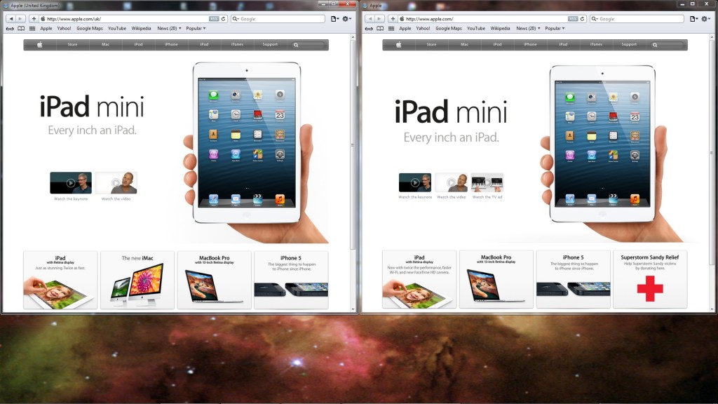
With the windows that much taller, the iPad mini in the right hand browser window – Apple’s main homepage – remains the same size, but the four links are now visible, which was the point. Note what’s happened in the left hand window, though – on the UK homepage, the picture of the iPad mini has been increased in size, and now (specific content aside) both pages look about the same.
In other words, the main image is being re-sized on the UK homepage, increasing from its minimum size as the page is made taller – which means any content below the visible area is pushed down further still as the image gets bigger; something that isn’t happening on Apple’s main homepage.
But that’s okay, isn’t it? Because in that last example, the iPad Mini is the same size in both windows – it won’t get any bigger, will it? Well, let’s see what happens with the browser windows tall enough to display the whole page for their main homepage:
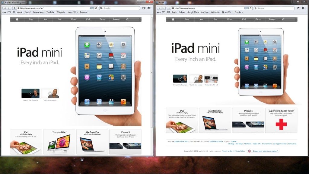
Although in the right hand window (Apple’s main homepage) the whole page is now visible, including all the usual links at the bottom, in the left hand window (their UK homepage – which includes the court ordered statement, don’t forget) the size of the main image has increased once again, making it larger than the equivalent image on the main homepage, and pushing the content below it further down the page, so that the four links remain at the bottom of the visible area.
With that in mind, what about making the browser windows the full height of the screen?
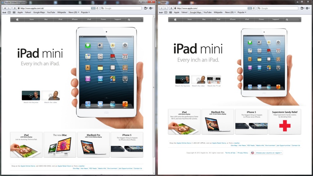
It’s clear from this screenshot that the main image had already reached its maximum size by the time of the previous one; it hasn’t increased any further, and almost the entire (UK) homepage is displayed in the browser window.
Almost.
It’s quite clear what’s missing, but for completeness, let’s scroll that left hand window to see what it is:
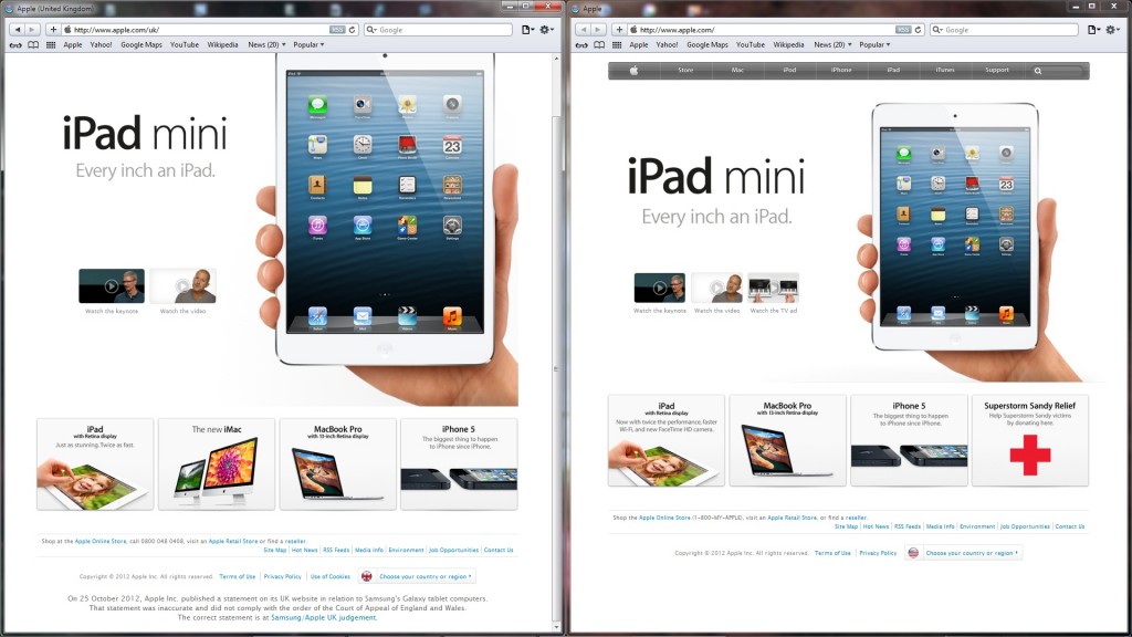
That’s convenient, isn’t it? The image has re-sized just enough so that the court ordered statement is pushed just off screen on a 1080 display. Even if the window is opened full screen, rather than just half its width, that statement is not visible without scrolling.
And it’s plain to see from the final image above that if the main image on the UK homepage was kept at the same size as the one on the main site, the statement would easily fit on screen.
Anyone would think Apple were trying to hide it from anyone visiting their website, or something!
This was brought to my attention in the form of this animated gif, showing the resizing in action – again on a screen at 1920 x 1080p.
Apple’s own browser, Safari, was used for the images above “for the lulz”, but the same effect is visible in any browser with scripting enabled.


